Create a Serene Sanctuary with Neutral Tones: Embracing Minimalism in Home Decor
Embracing the charm of neutral tones for your home is more than just a trend. It’s a timeless style that offers a tranquil and serene environment. In this article, we’ll delve into neutral tones home ideas that can transform your living space into a cozy haven.
Neutral color palettes are not just about whites and beiges. They encompass a wide range of hues, including soothing greys, soft browns, and muted pastels. We’ll explore how to effectively use these colors to create a harmonious and inviting atmosphere in your home.
Whether you’re a minimalist at heart or someone who simply appreciates understated elegance, you’ll find a wealth of inspiration in our selection of neutral tones home ideas. So, let’s dive in and discover the power of neutrals in home decor.
Exploring the Beauty of Neutral Tones
Step into a space adorned with soft, soothing neutral tones and you’ll instantly sense an air of tranquility. Maybe it’s the subtle greys, the hushed browns, or the delicate pastels that evoke this soothing ambiance. There’s a certain understated elegance about neutral hues, a timeless appeal that never fades.
The simplicity of subdued tones is rarely matched. It’s like an open, blank canvas that grants freedom to experiment and blend. I’ve witnessed some stunning interior designs where neutral hues have been infused with pops of vibrant colors. The contrast is striking and it gets your creative juices flowing.
To achieve a harmonious balance with neutral tones, one has to comprehend the role of lighting. In different lighting conditions, these whites, greys, and browns can appear dramatically different. Daylight breathes life into these shades, transforming them into vibrant expressions of elegance.
Neutral tones are versatile. They can blend seamlessly into minimalist spaces, contributing to a clean, uncluttered aesthetic. Or, they can serve as a quiet background, making bold furniture or art pieces the statement.
- The key is in being mindful of your decor choices.
- Less can indeed be more.
- Opt for sleek lines and minimalist designs.
With the right approach, even the most understated of neutrals can generate stunning decor. Let’s delve deeper into this fascinating world of neutrals to further understand their charm. By closely examining examples of layered neutrals or tones in combination, we’ll perhaps grow to appreciate their potential even more.
Exploring the world of neutral tones is akin to stepping into a serene sanctuary. Amid the hustle and bustle of our everyday lives, a balance of calming shades could be just what we need to bring about a sense of calm and harmony in our homes. It’s time to discover the myriad possibilities that lie in the realm of neutral tones.
The Versatility of Neutral Color Palettes
The versatility of neutral color palettes is a game-changer in home decor. It’s no secret that with the right blend, neutrals can help create a calm, balanced environment. Here’s the best part – it’s not all just about whites, greys, and beiges. Think chocolates, creams, taupes, and more. I’m talking rich, deep shades that can bring vibrancy into your spaces without overwhelming them.
A crucial benefit of neutral colors is their flexibility and resilience. They’re like chameleons, seamlessly blending into any space, style, or mood. Be it a modern, minimalist design or a traditional, vintage ambiance – neutrals have got you covered.
Are you craving a bit more excitement and fun in your rooms? Enter the concept of ‘pop of color’. This is your chance to get creative and bold. What’s wonderful is that neutral tones are perfect backdrops for vibrant colors. Let your imagination soar – a bright turquoise ottoman against a beige wall, a crimson pendant light in a grey-themed kitchen, emerald green cushion covers on a crisp white sofa – the options are limitless and thrilling.
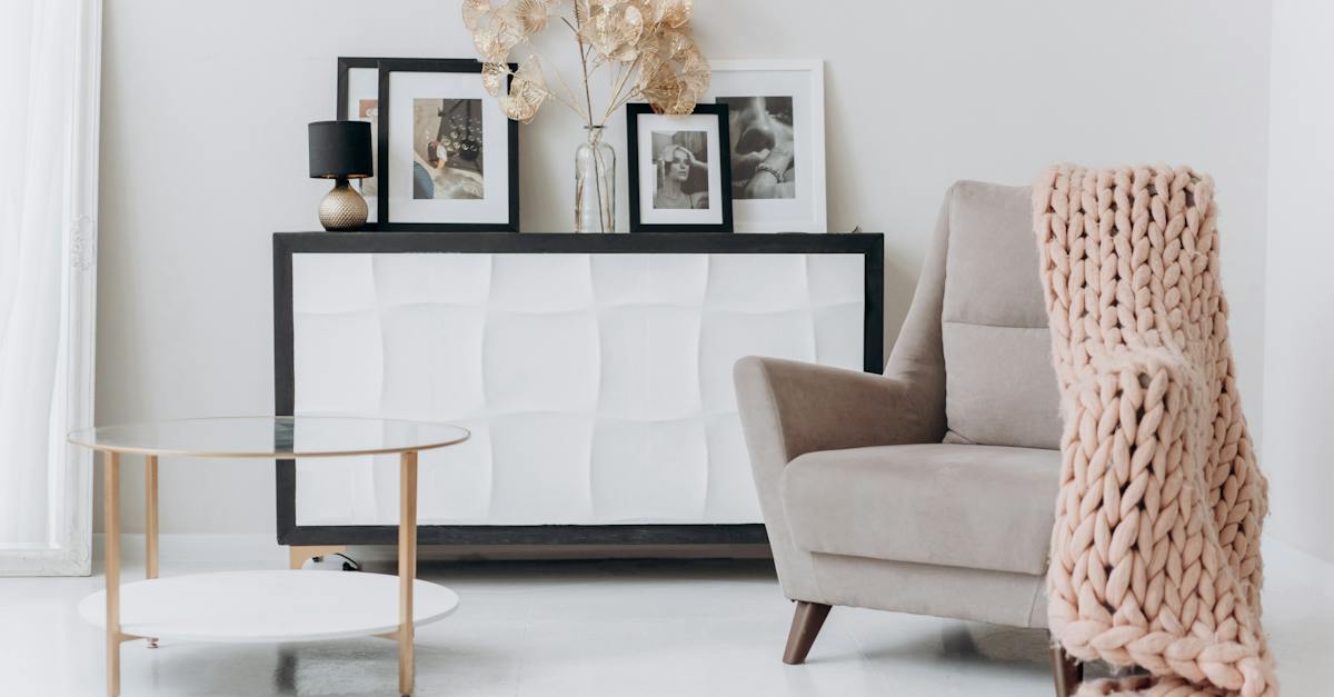
Here’s a quick tip: don’t forget the role of textures. Yes, textures! Even within neutral tones, you can mix different materials and surfaces to add depth and personality. Consider a leather armchair, sleek metal tables, plush rugs, shiny sateen curtains – all playing their part in elevating the elegance of your neutral palette.
Neutral palettes are not static or boring. They’re dynamic, adaptable, and oh-so-stunning in their subtlety. It’s like an artist’s canvas, awaiting your touch of magic. Embrace the world of neutral tones, and you’ll discover a range of exciting decor options just at your fingertips. It’s all about finding the right balance and reveling in the sheer beauty and harmony that neutrals can bring into your home.
Creating a Serene and Tranquil Living Space
Making a living space that’s calm and quiet means more than just selecting the right colors. A harmonious mix of elements that speak to the senses, respecting the balance between empty and filled spaces, and providing an overall sense of serenity, all come into play. Let’s dive into how neutral tones can remarkably contribute to this goal.
Choosing a neutral color palette is the first step to achieve tranquility. I believe chocolates, taupes, and creams are ideal choices for those looking to create a warm, cozy vibe. Delicate, airy colors infuse a space with a soothing energy. But don’t limit yourself to these alone; make use of varying shades within the same neutral spectrum for a layered, nuanced look. In the end, it’s all about creating an atmosphere that resonates with your personal taste and style.
Adding a touch of vibrance to your neutral scene may sound contradictory, but it’s not. Accents of bright, complementary colors can enliven space gracefully. Consider, for instance, a cluster of fiery red throw pillows against your taupe sofa, or a deep purple rug complementing your cream-colored floors. These details serve as striking focal points amidst the soothing scene, without overpowering it.
Texture is another aspect that can enhance the charm of a peaceful dwelling with neutral hues. Imagine lounging in a living room draped in different fabrics – a crochet throw, a velvet couch, a rough-hewn wooden table. Doesn’t it sound enchanting? Then add in a bit of lavishness with a touch of silk or satin. These materials, with their unique tactile experiences, can bring the area to life, amplifying the elegance of the neutral background.
As you venture into remodeling your living space with a neutral palette, remember: there are no boundaries. The possibilities and combinations are vast, and the creative freedom is yours to relish. So, trust your instincts, and boldly blend neutrals to create your dream, serene home.
Choosing the Right Shades for Your Home
Selecting the right shades plays a pivotal role in creating a harmonious neutral color palette. Although neutrals might seem straightforward, it’s no small feat to navigate through the multitude of nuances.
Consider the role of your rooms. Are they places for relaxation or do they buzz with activity? Lighter hues like whites, creams, and soft greys are ideal for building a serene setting. Spaces for entertainment and dining can withstand deeper shades such as chocolates, taupes, and beiges.
Don’t be afraid to layer shades within the same neutral spectrum. Using varying tones lends depth and complexity, adding a touch of sophistication to your interiors.
Here’s a pointer – neutrals aren’t restricted to whites, greys, and beiges. Think outside the box! Subtle pastels like soft blues, pinks, or lilacs can also serve as a base for your neutral palette.
Remember, the choice of neutrals for home decor isn’t just about colors; it’s a holistic approach that hinges on balance. When it comes to a neutral palette, it’s essential to balance light and dark, empty and filled spaces.
Keep the bigger picture in mind while choosing shades. Does the color scheme flow through the house? Balance consistency and change as you move from one room to another.
Introducing bright, complementary accents is a brilliant way to enliven a neutral space. Splashes of vibrant colors can add an element of surprise, making your homely neutrals sing.
A few carefully chosen pieces can also introduce much-needed texture. You don’t want your tranquil, serene space to flatline into the realm of boring.
Come, join me on the journey of creating stunning neutral spaces. Let’s explore the beautiful world of neutral home decor together!
Embracing Minimalism with Neutral Tones
Injecting the minimalist aesthetic into your home decor doesn’t mean you’re restricted to stark, clinical spaces. You can create a balanced and sophisticated design that’s anything but boring by using an array of neutral shades.
A neutral palette works wonders when striving for a minimalist living space. It’s the perfect canvas for sparse furniture and striking, simple pieces that define minimalism. The key lies in focusing on the essentials and letting the neutral tones do the talking.
Take a walk through your home and think about the rooms where tranquility is the top priority. The living room, bedrooms, or perhaps a yoga room – these areas could greatly benefit from a neutral touch. I’ve found that cooler neutrals like whites and light grays exude peace much more effectively than their warmer counterparts.
Now shift your focus to more active spaces such as the kitchen or a workspace. Here, you can consider darker neutrals like black or deep grays. These shades create a more defined, dynamic space primed for action and contrast strikingly with lighter neutrals elsewhere in your home.
To keep these spaces from feeling flat or washed out, remember to:
- Play around with texture
- Add in variety with materials
- Use a range of similar hues for a subtle contrast.
The key to this balance lies in the simplicity of the minimalist style. Minimalism isn’t about removing everything. It’s about making room for the things that truly matter to us.
Neutral tones can provide a sense of calm and serenity, yet they breathe life into your space in a subtle, minimalist way. Injecting a sense of life into your decor doesn’t require bright colors or loud patterns. It requires balance, and neutral tones are the perfect tool to help you achieve it.
So let’s continue our journey of creating stunning neutral spaces, embracing minimalism, and crafting homes that are tranquil, striking, and uniquely ours.
Conclusion
Neutral tones are more than just a design trend. They’re a reflection of our desire for calm and tranquility in our living spaces. With the right balance of shades and textures, you can create a space that’s sophisticated, inviting, and uniquely yours.
Remember, it’s not just about the color on the walls. It’s about the overall feel of the room. That’s where the magic of neutral tones really shines. They allow you to create depth, drama, and intrigue, all while maintaining a serene and tranquil atmosphere.
So, don’t be afraid to experiment. Incorporate subtle pastels, add bright accents, or stick to a monochromatic palette. The possibilities are endless.
In the end, the most important thing is that your home reflects you. And with neutral tones, you can do just that. So, here’s to creating beautiful, tranquil spaces that truly feel like home.
Q: Why should I use neutral color palettes in home decor?
A: Neutral color palettes offer versatility and create a serene and tranquil living space. They can be easily paired with other colors and provide a timeless and sophisticated look.
Q: How do I choose the right shades for different rooms?
A: For relaxation areas, opt for lighter hues, while deeper shades are suitable for spaces with more activity. Varying tones within the same neutral spectrum can add depth and sophistication to the overall design.
Q: Can I incorporate pastel colors into a neutral palette?
A: Yes, subtle pastels can be incorporated into a neutral palette to add a touch of softness and interest. Balance is key in maintaining the overall harmony of the space.
Q: How can I enliven a neutral space?
A: Add bright, complementary accents and textures to bring life to a neutral space. Play with different materials, patterns, and textures to create visual interest and depth.
Q: Can neutral colors be used to embrace minimalism in home decor?
A: Absolutely! Neutral tones are perfect for embracing minimalism. Use cooler neutrals for areas where tranquility is a priority and darker neutrals for spaces with more activity.
Q: How can I prevent neutral spaces from looking flat?
A: Incorporate texture, materials, and subtle contrast to keep neutral spaces from feeling flat. These elements add visual interest and depth to the overall design.